Nov. 2020
Role
UI Researcher & Designer
Tools
Miro & Figma
Overview
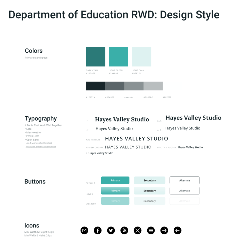
The US Department of Education website is a vital resource for financing one's post-secondary education; currently, there is a loss in engagement due to the current design of the website. The solution is an entire redesign that focuses on the following UI design guidelines while also keeping essentials assets.
Research
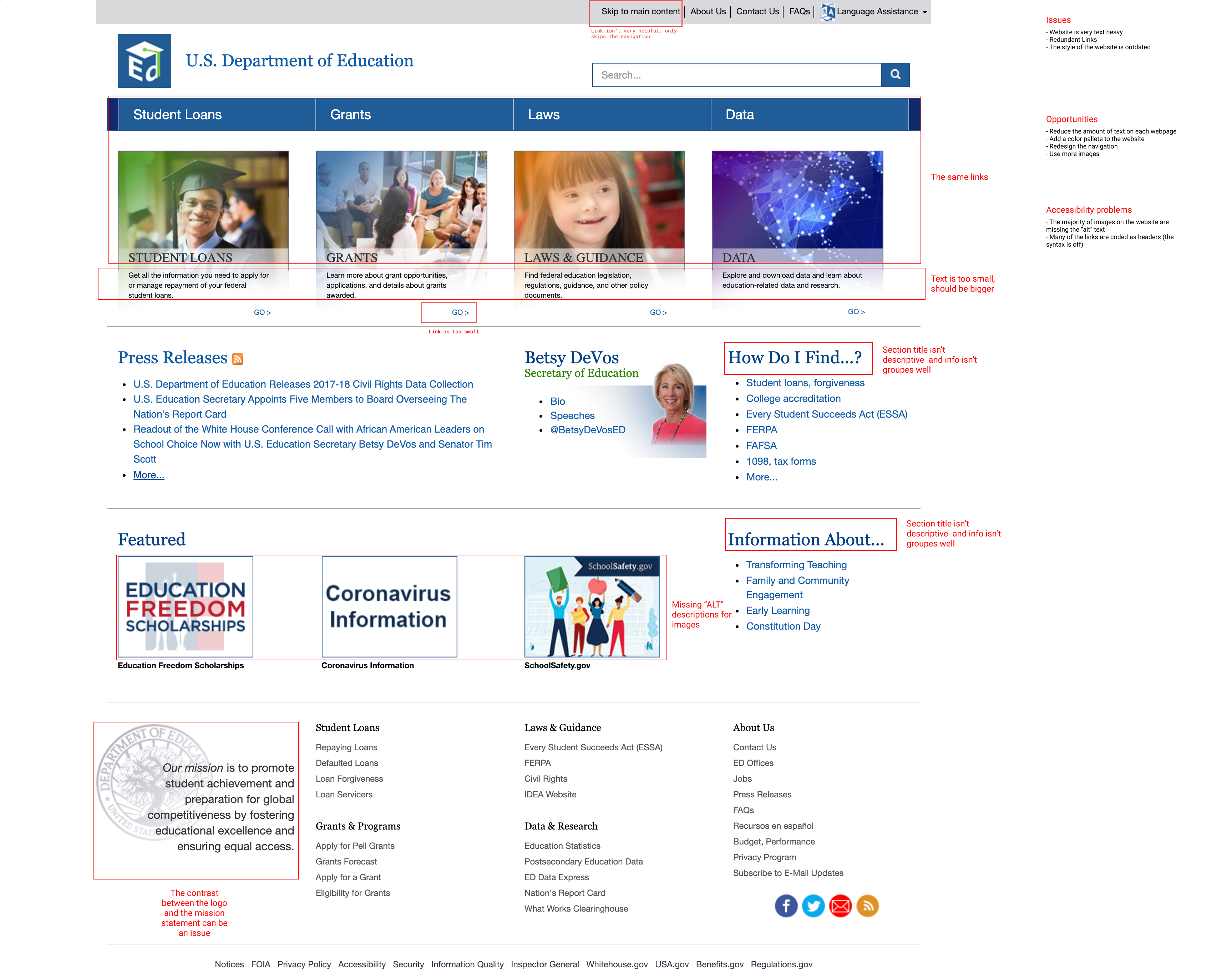
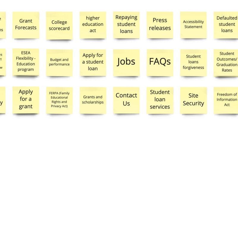
To understand what was required to make a redesign that would improve the engagement on the Department of Education's website, two actions were required: redline annotations and card sorting.
Redline Annotations:
Issues:
- The website is very text-heavy
- Redundant links
- The style of the website is outdated
Opportunities:
- Reduce the amount of text on each webpage
- Add a color palette to the website
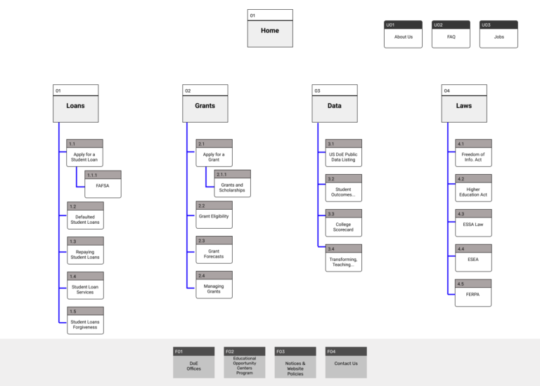
- Redesign the navigation
- Use more images
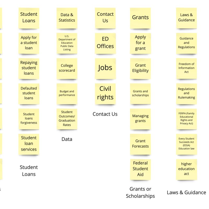
Card Sorting:
Tested four users to create groups of the 30+ cards
Main Conclusion:
- The site navigation needed reorganization so users could easily progress through the website.
Prototype & Test
Lo-Fi Wireframes:
Usability Testing:
Objective: |
To find the usability of the homepage and to prove the navigation is easy to use for both the desktop version and mobile. |
Task 1: |
Find the primary navigation bar on the homepage. |
Task 2: |
Complete the workflow of applying for a loan. |
Task 3: |
Repeat the task on the mobile version. |

