Dec. 2020
Role
UX/UI Researcher & Designer
Tools
Miro & Figma
Overview
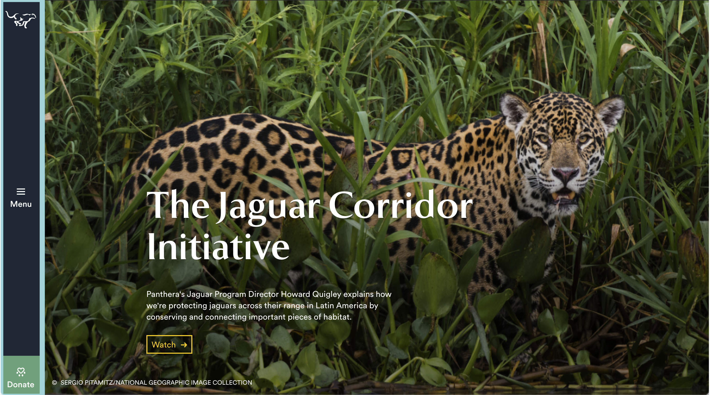
With a redesign of the Panthera website (a nonprofit focused on the conservation of big cats), this nonprofit would bridge the gap between their passions and the user experience. By following a few UX/UI plans this website can be a lot stronger.
Research
What is Panthera?
Panthera is an organization dedicated to the protection, preservation, and prosperity of wild cats, developing and implementing conservation initiatives in 39 countries around the world.
Panthera’s range-wide conservation strategies are focused on the world’s largest, and some of the most imperiled cats: tigers, lions, jaguars, snow leopards, leopards, pumas and cheetahs.
Why Redesign This Site?
After looking through a number of sites, this one stood out due to the sheer amount of care and expertise Panthera communicates.
The gap between the passion, the nonprofit exhibits, and the user experience can shorten with proper UX/UI strategies.
Site Annonations:
Competitive Analysis:
The competitive analysis focused on two direct Non-Profit competitors (Big Cat Rescue and Wildlife Conservation Society).
| Big Cat Rescue | Wildlife Conservation Society | |
|---|---|---|
| Strengths |
|
|
| Weaknesses |
|
|
The Problem:
- While their site, projects, and articles are visually appealing and legitimately compelling, Panthera’s website is cumbersome to navigate and doesn’t effectively communicate its mission and programs.
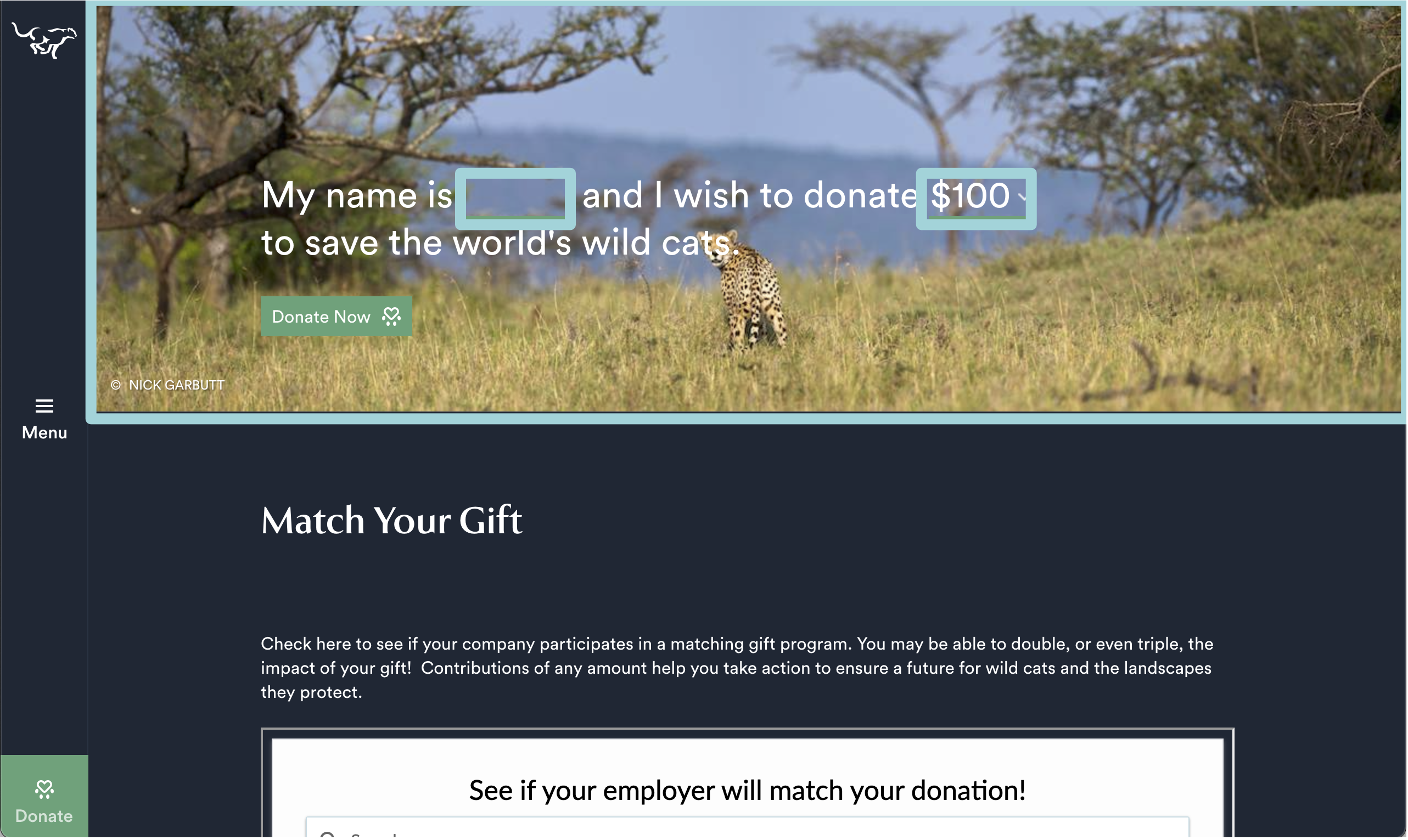
- While it’s clear they put a lot of effort into their site, the UX/UI components let them down impeding users from quickly understanding, navigating, and even donating essentially defeating the purpose of the site.
The Solution:
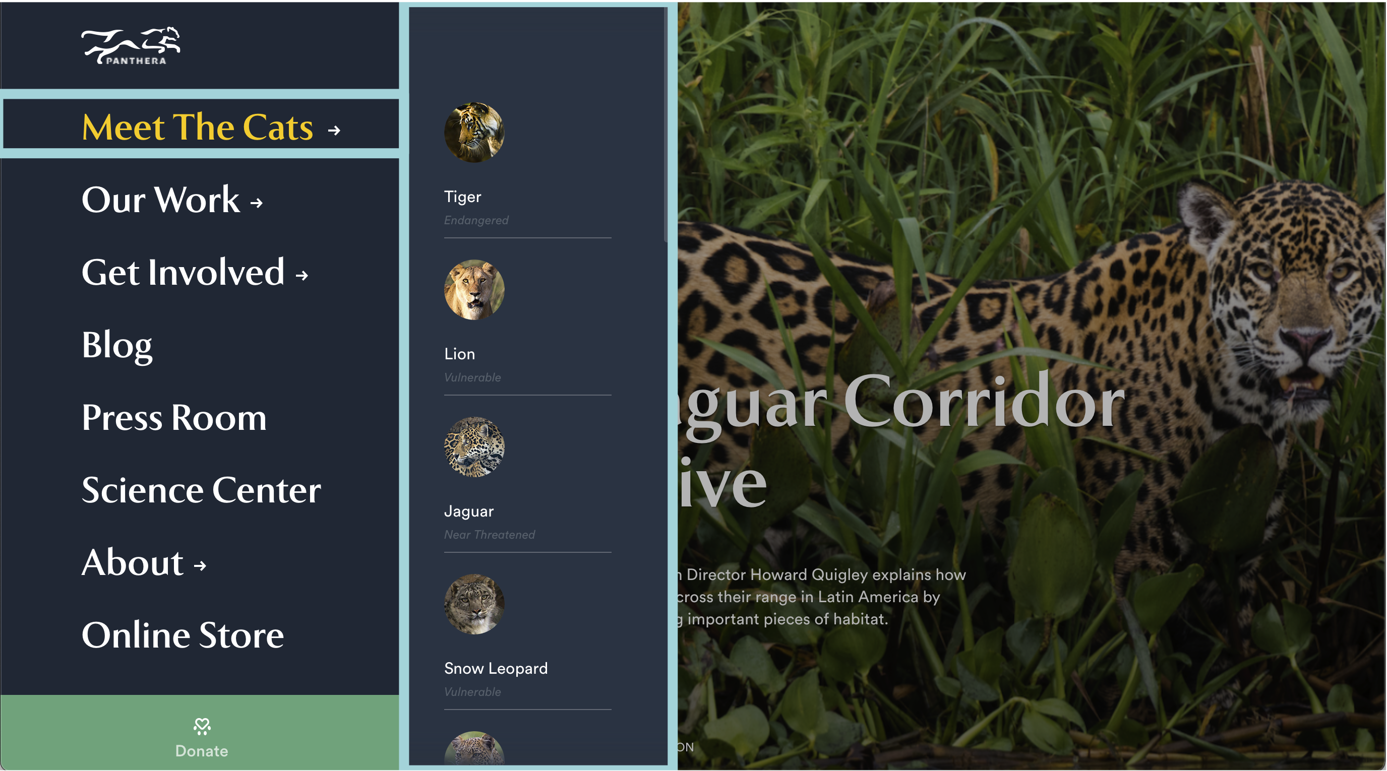
- By stating their mission clearly, emphasizing the impact and reach of their projects on cat populations, simplifying the donation methods, and streamlining navigation, we believe the site will be more efficient, and its goals more attainable.
- Can improve usability by taking advantage of the dynamic logo, aesthetic color scheme, and plethora of high-quality photographs Panthera already uses to stay true to its brand while elevating its UX/UI structure.
Prototype & Test
Lo-Fi Wireframes:
Usability Testing - Lo-Fi:
Objective: |
To ensure users have the easiest accessibility to explore the site, donate, and learn more about Panthera’s cause because most people who visit the site do not know what Panthera is about at first glance. |
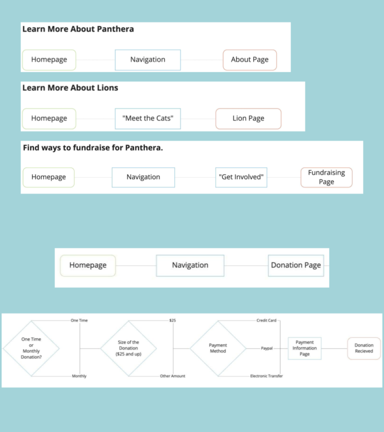
Task 1: |
Learn Panthera's mission. |
Task 2: |
Find information about Lions |
Task 3: |
Discover how to fundraise |
Task 4: |
Make a donation |


